I’ve been learning about web development for just over a year. Yay! Happy coding anniversary to me! 🥳🥳🥳
It’s crazy to think about how much I’ve learned and grown in a relatively short amount of time. And it’s even crazier to think about all of the things I have yet to figure out. As a part of my active learning, and learning in public, I have written before about there always being something new to learn. In addition to trying new tools and using new skills, I think an important part of learning is building fluency or proficiency with tools and skills you already have. But this can be hard to measure sometimes.
CSS has been my nemesis for a while. I can style things with vanilla CSS, Bootstrap, and Tailwind. But, there is always somewhat of an element of mystery to it all. Like, why can’t I get this element to go in the center? Or, why does the margin on this other thing change on mobile screens?! Like, how many times do I need to google “how to center a div with flex” before I really figure it out? 😅
While I have yet to really work out the full mysteries of CSS, I did have a little success the other day that I wanted to share here.

Using grid by heart
Now that I’ve blabbed on for a while, let’s celebrate the success!
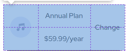
So, the other day, I was building a little order summary component that included a little section in the middle with various elements within the section. It included an image, a couple text areas, and a link to change the order. When I first started the build, I created the HTML shell, but I wasn’t quite sure how I should go about arranging the elements in this particular part of the component in the right way.

Then the other evening I sat down to look at the component. It was suddenly rather clear what a possible solution might be. So, I drew a little grid in my notebook. And then created the relevant CSS classes to get things started. Finally, I started writing the CSS to create the required layout using grid.
All by heart. I didn’t google a thing!
Building the grid layout
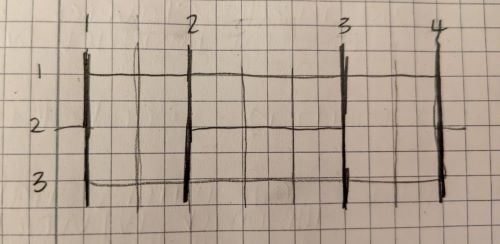

I decided to use grid to create the desired layout. So, I used the grid display in the parent component. Then I assigned each of the pieces within the grid, the grid items, a unique class to assign the positioning. Then it was just a matter of using my little drawing to input the appropriate row and column numbers to put the pieces together like a little puzzle.
My HTML looked like this:
<div class="plan-container">
    <img
      class="grid-item-1"
      src="./Project Requirements/images/icon-music.svg"
     />
     <p class="grid-item-2">Annual Plan</p>
     <p class="grid-item-3">$59.99/year</p>
     <p class="grid-item-4">Change</p>
 </div>
And my CSS looked like this:
.plan-container {
display: grid;
grid-template-columns: 2fr 3fr 2fr;
grid-template-rows: 2fr 2fr;
padding: 1rem;
box-sizing: border-box;
margin-bottom: 1.5rem;
background-color: hsl(225, 100%, 98%);
border-radius: 10px;
}
.plan-container p {
margin-top: 0px;
margin-bottom: 0px;
}
.grid-item-1 {
grid-column: 1 / 2;
grid-row: 1 / 3;
place-self: center;
margin-right: 1rem;
}
.grid-item-2 {
grid-column: 2 / 3;
grid-row: 1;
padding-top: 1vw;
font-size: 4vw;
letter-spacing: -0.5px;
font-weight: 700;
}
.grid-item-3 {
grid-column: 2 / 3;
grid-row: 2;
font-size: 4vw;
letter-spacing: -0.5px;
color: #99a0ae;
}
.grid-item-4 {
grid-column: 3 / 4;
grid-row: 1 / 3;
place-self: center;
margin-left: 0.5rem;
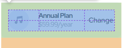
}Literally, I refreshed my browser to see how things looked after whipping up this bit of code, and everything was more or less where I had hoped it would be. No mysteries here!
I adjusted the padding, margin, and background color, and my little component section was really close to the example from the brief.
Here’s what my final build looks like. You can check out the deployed version here.

Celebrate the little wins
So, you might have gotten this far in this post and be thinking to yourself, “Nice work, weirdo. You had to google how to center a div, and now you’re celebrating writing some simple CSS by heart.”
Yeah, I am. And you should celebrate the little wins, too.
Whether you are new to coding or have been at it for years, there is always something new to learn and master. And if you’re not celebrating your successes, no matter how trivial they may seem, who is going to?
So, go on. I bet you have something to celebrate today. Take a minute and give yourself the credit you deserve! You’re doing it! Nice job. 🎉